
How I Designed FLAME Logo


Flame logo design process
Designing  a logo is a process of make people understand an organisation to its bare essence.
As a client briefs you about the company/organisation, name and its nature of work, your mind begins find images that would represent the organisation. 
in this case it was an NGO working for the well-being of HIV AIDS patients and those affected by it.  
The brief given to me by the organisation is 

FLAME 

Franciscans Life Affirming Movement for Empowerment


We are not going to restrict ourselves to HIV/AIDS ministry. We are planning to spread our ministry to various areas such as environmental programmes, Children and youth programme, women self-help groups and so on.

Therefore think of any logo that symbolises giving life  (light) to the people and the earth (environment). Try to make is simple and attractive.


The motto could be added to the logo.

"LET THERE BE LIGHT"


Its not a sophisticated brand or service, so my mind lingered around images of flame and its light spreading through. 


Cartoon Fire Png Min


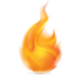
Flame and its light spreading through. Through where? 
Through a person's world, through many persons' world, or even to the entire planet.
so I arrived at the image of a world.

Earth Globe Png - Globe Earth Png Transparent PNG - 720x720 - Free Download  on NicePNG


After sketching a globe and a flame on my sketch board i began to compose it.
4 elements had to be composed 
1. flame
2. globe
3. the name 'flame'
4. the motto, 'let there be light'

my thought process: 
The 'globe' and 'flame' are over used images. how will I make it look different. How will i make it look unique? A process I call as 'idealising'.

I minimised the globe to shreds, yet recognisable. 
I created a word-art with the word flame in the shape of a real flame.
After weighing many options o positioned the flame into the globe like a diya.
And balanced and completed the globe with the motto-phrase.


As an NGO, their logo would be printed on banners, T-shirts, etc. so I kept it more flat.
A logo has to be versatile. 
Gave options with warm, bold colours (red, yellow and their shades);
and with subtle cool colours (shades of blue). 

Comments

Popular posts from this blog

Visual Analysis: INTRODUCTION

 Visual analysis is a systematic and scientific examination of visual materials that explores their communicative meaning, aesthetic qualities, and functional impact. As Susan Sontag noted, humans tend to linger in "mere images of the truth," making it crucial to develop a deeper understanding of visual interpretation. Study the PDF below (for academic use only) Introduction to Visual Analysis PDF The Nature of Seeing: The process of seeing is not as spontaneous or natural as commonly believed. According to John Berger, our way of seeing art has historically been influenced by privileged minorities to maintain social and economic dominance. Visual perception requires conscious effort and is heavily influenced by habits and conventions. The visual faculty consumes approximately two-third of a person’s used energy, highlighting its significance in human experience. The Framework of Visual Analysis: Visual analysis could be traced back to communication models, for example, Har...

Visual Analysis: SEMIOTICS

 Visual analysis is a systematic and scientific approach to examining visual materials that goes far beyond casual observation.  In our visually saturated world, images have become a inescapable universal language that shapes our perceptions, attitudes, and experiences. From the artworks adorning gallery walls to the advertisements lining city streets, visuals communicate narratives, evoke emotions, and reflect sociocultural ideologies. However, the process of seeing and interpreting visuals is not as spontaneous or natural as we often assume. As John Berger notably stated, "seeing is an active decision," suggesting that the process of interpreting visuals is neither spontaneous nor natural, but rather requires conscious effort and critical thinking. The way we perceive and interpret visual content is heavily influenced by habits, conventions, and our individual perspectives.  Serious visual analyses requires conscious effort and critical analysis to unravel the laye...

Visual Analysis: LANGUAGE, ELEMENTS, AND GRAMMAR

 Visual communication plays a powerful role in shaping our understanding of the world. Like written and spoken language, visuals employ a complex grammar and system of meaning. Study the PDF below (for academic use only) Visual language, elements, and grammar PDF At its core, visual grammar is comprised of fundamental elements like line, shape, colour, texture, space, and typography. These are the basic building blocks that visual creators assemble and organise using principles like emphasis, contrast, composition, size, proportion, balance, and lighting. Just as words are assembled following the syntactical rules of language, visuals are constructed by purposefully arranging and relating these elemental units. Lines, for instance, can convey a range of associations through their orientation and qualities. Horizontal lines suggest stability and calm, verticals impart a sense of strength and authority, while diagonals imbue dynamism and movement. The weight and curvature of lines fu...

Visual Analysis: WHAT ARE VISUALS?

  Visuals are images/collection of images that are  made to be  seen. There is a continuum of images in which people live; and visual is a paused/frozen moment from them. Study the PDF below (for academic use only) What Are Visuals? PDF People/artists/designers capture/construct/make images/visuals for others to see. Therefore we only see the image/visual/frame that is given to us to see. For John Berger, a visual is a sight which has been recreated or reproduced ... which has been detached from the place and time in which it first made its appearance. Art: Traditional art, the oldest form of visual expression, represents humanity's first attempts to interpret and document the world. From prehistoric cave paintings to Renaissance masterpieces and contemporary installations, art has evolved beyond mere representation to become a vehicle for emotional, philosophical, and social commentary. Artists manipulate colour, form, texture, and space to create works that challen...

The Brown Sisters: A Four-Decade Portrait of Time and Sisterhood

 Nicholas Nixon's "The Brown Sisters" stands as one of photography's most compelling longitudinal portrait studies, documenting four decades of sisterhood through annual black-and-white photographs taken from 1975 to 2014. Using an 8×10 inch view camera, Nixon captured his wife Bebe and her three sisters—Heather, Mimi, and Laurie Brown—in the same order each year, creating a remarkable visual meditation on time, aging, and familial bonds. For the full set of images see the PDF below (for academic use only) Forty Portraits in Forty Years PDF What began as a spontaneous family photograph in 1975 evolved into a profound artistic documentation of human transformation. The project's strength lies in its methodological consistency: the sisters maintain their positions, with the sequence remaining unchanged throughout the series. This rigid framework paradoxically highlights the subtle changes that occur year by year, creating a powerful commentary on the passage of time...

A Critical Visual Analysis of Jan Banning's ‘Bureaucratics’

 Jan Banning's photographic series Bureaucratics offers a remarkable anthropological study of civil servants across eight countries, revealing how power, hierarchy, and cultural identity manifest in governmental spaces. Through meticulously composed photographs taken from a citizen's perspective, Banning unveils the theatre of bureaucracy the most immediate visual impact comes from Banning's consistent methodology: each photograph is taken from the same height and distance, positioning the viewer in the role of a citizen approaching the bureaucrat's desk. The bureaucrats are photographed in their natural habitat – their offices – which become stages where power dynamics and cultural values are performed daily. Make visual analysis of  Bureaucratics  by Jan Banning given below. Bureaucratics by Jan Banning PDF  (for academic use only) In examining the spatial arrangements, a clear pattern emerges: the desk serves as both barrier and symbol of authority. In many image...

2025 Must Create Its Own Art

 Tonight’s art becomes inadequate
and useless when the sun rises in
the morning. The mistake lies not in creating art for tonight, but in assuming tonight’s answers will serve tomorrow’s questions. Louise Bourgeois, a French American artist, reflected, “art is a guaranty of sanity;” but that guarantee must be renewed with each dawn, each cultural shift, and
each evolution of human consciousness. If some art endures through generations, it
is only because of its capacity to speak, its ability to demand fresh interpretations that test and challenge the new. To guarantee sanity in the coming year, 2025 must create
its own art. Why create art? Why watch art? Why read literature? True art, in the words of Sunil P Ilayidam, shakes that which is rigid and unchangeable. Art serves as humanity’s persistent earthquake, destabilising comfortable certainties and creating space
for new ways of seeing, thinking, and being
in the world. An artist’s duty is to reflect the times, and we see this in...